Typography, the art and technique of arranging type to make written language legible, readable, and visually appealing, has always been a crucial element in design. However, in Japanese design, typography transcends its conventional role; it becomes a form of storytelling, where every font is meticulously chosen to convey feelings, traditions, and narratives that go beyond the written text.
Japanese typography blends tradition with modernity, combining elements from centuries-old scripts with contemporary design philosophies. This interplay is particularly evident in how designers creatively manipulate typefaces to reflect Japan’s rich cultural tapestry while catering to the ever-evolving aesthetic sensibilities of modern society.
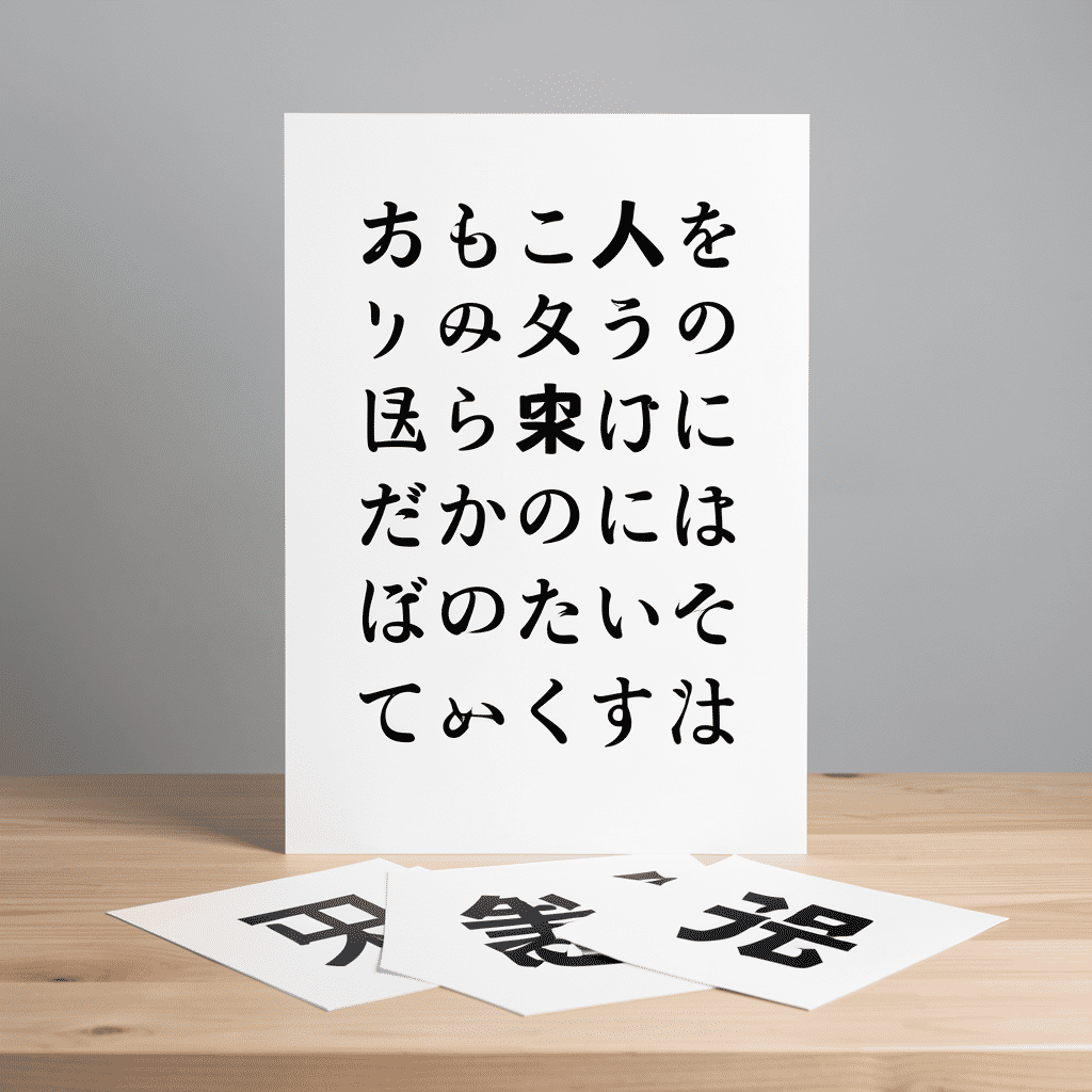
The foundation of Japanese typography lies in its unique writing systems: Kanji, Hiragana, and Katakana, each offering distinct characteristics and emotional tones. Kanji, adapted from Chinese characters, often carries historical weight and profound meanings, ideal for conveying depth and seriousness. Meanwhile, Hiragana, with its rounded and flowing shapes, exudes a softer, more approachable quality, well-suited for casual and friendly contexts. Katakana, known for its angular and straightforward lines, is often used to evoke modernity and is commonly seen in foreign loanwords and onomatopoeic expressions.
In Japanese design, typography is not merely about selecting a typeface; it’s about crafting a narrative. For instance, a flyer for a traditional tea ceremony might employ classic Kanji with brush-like strokes, invoking a sense of cultural heritage and timeless elegance. On the other hand, a cutting-edge fashion magazine might utilize sleek, angular Katakana to project a sense of avant-garde flair and futuristic style.
Moreover, Japanese typography is a playground for experimentation. Designers frequently integrate elements like gradients, textures, and shadows to create dynamic visual effects. This not only enhances readability but also adds layers of emotional depth, drawing viewers into a more immersive experience.
A key aspect of Japanese creative typography is its symbiotic relationship with imagery. Often, type is integrated seamlessly with visuals, creating compositions where text and images are not separate entities but parts of a cohesive whole. This integration can evoke an emotional resonance that pure text or imagery alone might not achieve. For example, in anime posters or manga cover designs, typography often interacts with character illustrations, either by framing them or echoing their actions, to enhance dramatic impact and thematic coherence.
Color theory plays a significant role in this context. Colors are carefully selected to complement or contrast with the typefaces, depending on the emotions or messages designers wish to convey. Warm hues might be chosen for festive or nostalgic designs, while cool tones could be used to express tranquility or minimalistic sophistication.
Importantly, Japanese designers are not confined to static illustrations of text but often employ motion and interactivity, especially in digital media. Animated typography can transform letters into living entities that capture attention and enhance storytelling, adding a temporal dimension to design that resonates with digital audiences accustomed to interactive and dynamic content.
In conclusion, creative typography in Japanese design is much more than just text arrangement. It is an art form that communicates on multiple levels, engaging the mind and senses through a harmonious blend of historical reverence, playful innovation, and thematic storytelling. This approach challenges and inspires global designers to see typography as a versatile narrative tool capable of deepening the connection between the message and its audience.